The checkout already worked.
I had to make every change earn its place.
Jimdo is a website builder for small businesses, sold as a subscription, and its checkout was converting above industry average. As the designer on checkout, I found the changes with the best return for the effort and agreed up front how each one would be tested, so the evidence settled them, including the one I lost.


Checkout already converted well. My job was to find what was still leaving money on the table, and to prove each change was worth shipping.
I was the only designer on the team, and with no PM for long stretches I also pulled the funnel data, wrote the hypotheses, prioritised them with engineering and stayed through handoff and the A/B results.
 A checkout library built from scratchso most test variants took an afternoon to build.
Everyone agreed checkout could be better
Improving something that already works is harder than fixing something that does not. There is nothing obviously wrong to point at, so every change has to be argued for.
I ran a design critique of the whole flow with the design team, to turn a shared hunch into something written down by more than one person. Every note on that screen has an author who is not me, which is what made it useful in the next conversation.
It confirmed what I suspected about the flow and about pricing, but a wall of notes is not an order to work in. So I took it to the data: Mixpanel and Tableau for where people were leaving, usability tests in Maze for what they hit on the way. I did not know Mixpanel when I started, so I asked the data team to teach me and started building my own boards. A question you can answer yourself is a question you ask more often.
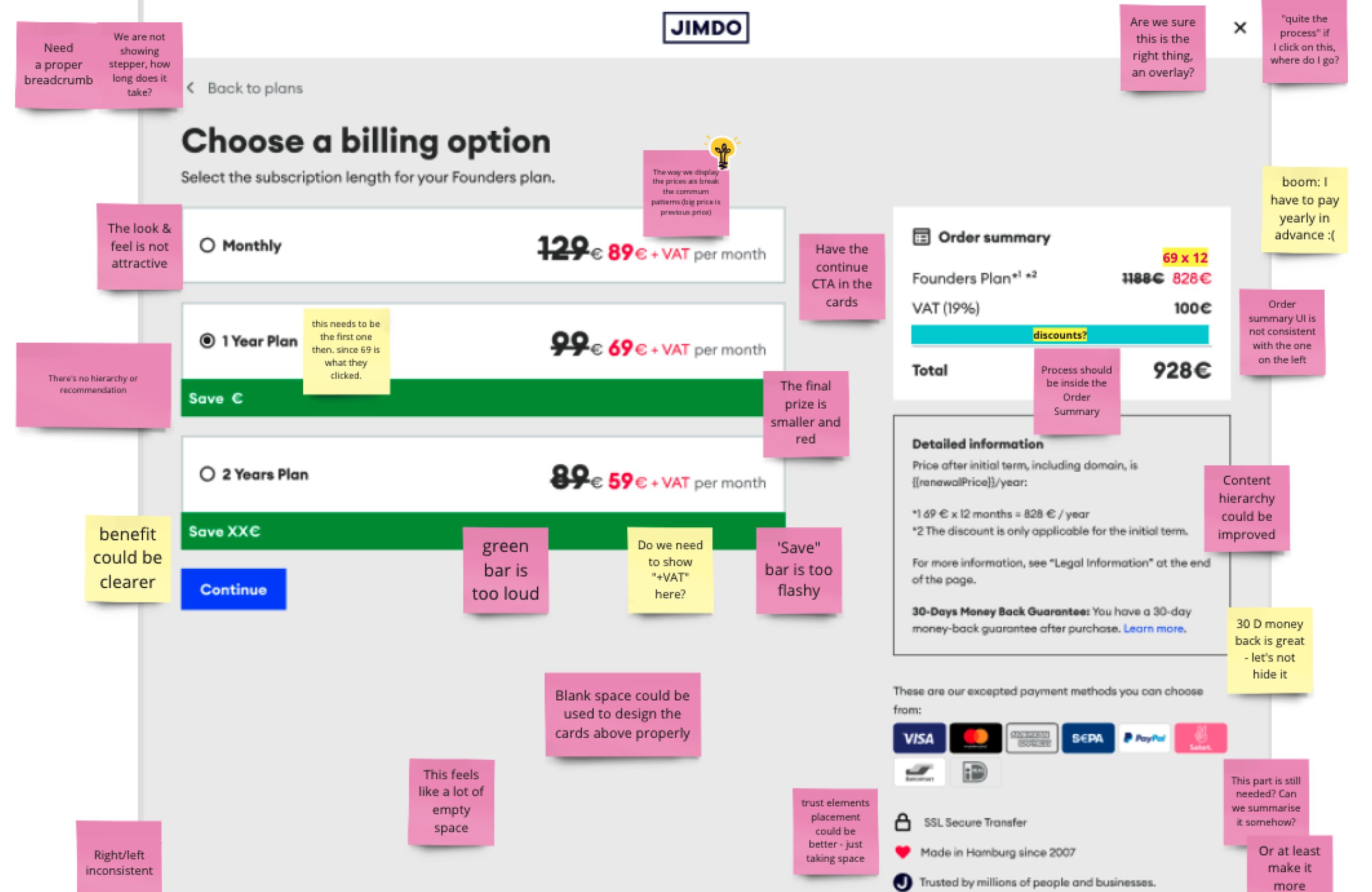
It all pointed at five things, and each one became part of the work.
Too many steps
Extra screens in a flow whose job is to collect a payment.
Nothing being offered
No upsell strategy, and no add-on prompt anywhere in the flow.
Pages with no owner
In-product pages, each with its own UI and weak hierarchy.
Missing payment methods
No Apple Pay, and outdated integrations.
Weakest on mobile
Higher drop-off on phones, and few trust signals to hold anyone.
A page nobody had claimed
Five problems, and engineering time for a few. The question was which one moves the number for the least effort, and how to prove it before anyone spends a sprint on it.
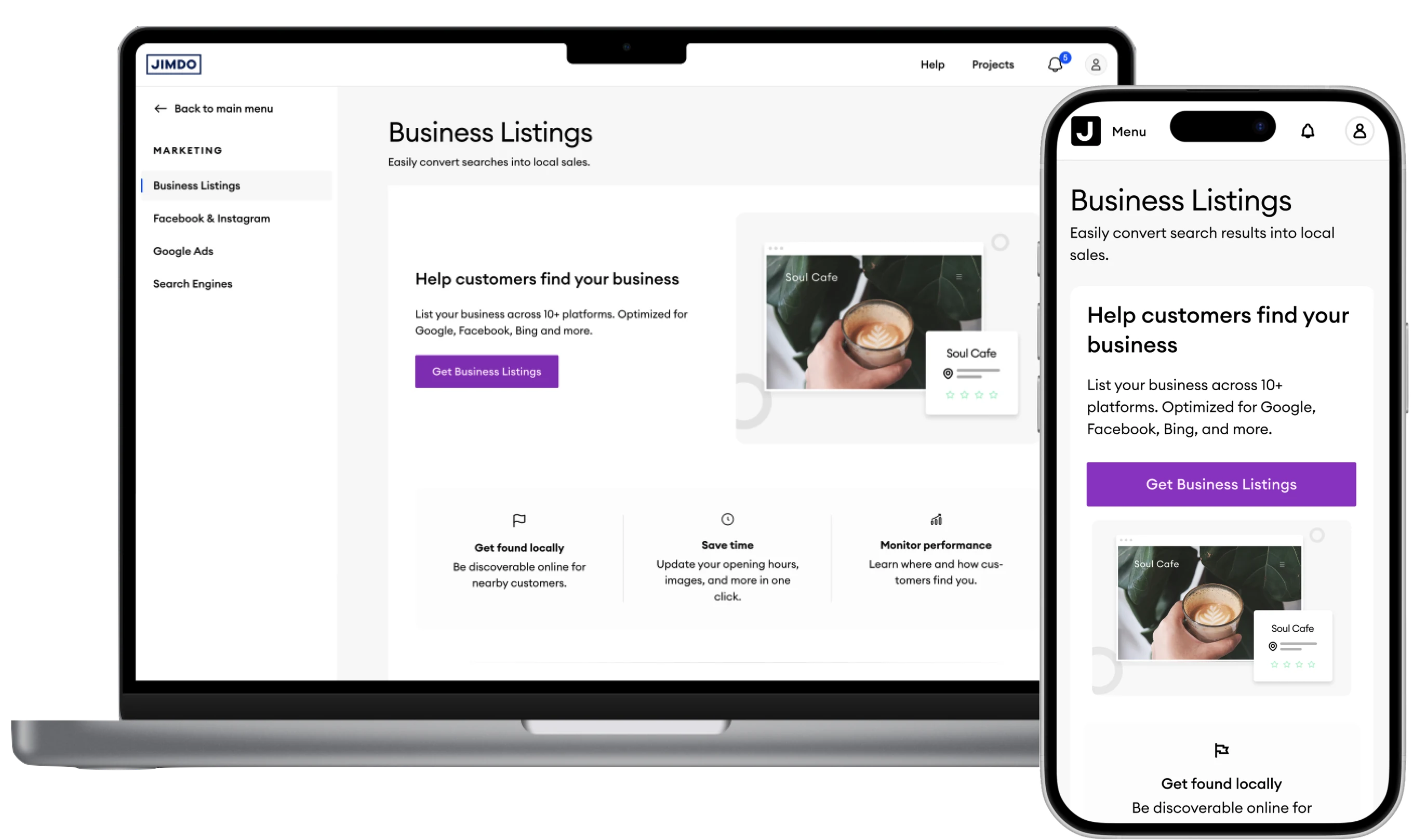
Through long stretches without a PM, I also pulled the funnel data myself, wrote the hypotheses, and prioritised them with engineering by effort, in phases. Business Listings came first. It was one of the oldest features, useful for every user, and it was sold from a page inside the product that had been waiting a long time for a team to pick it up. There were even designs already drawn. I proposed we take it, and my team ran it even though it was not our area.
It took about a week of work. We A/B tested the old page against the new one, measuring in our Mixpanel boards and also in Tableau, led by the data analysts. The new page converted 2% better, on a page that sells a paid feature, so we closed the experiment and shipped it. The same pattern then went to the other feature pages, each one a starting point if you already have the feature and a selling point if you don't.
Fewer steps, and a way to test demand
We removed redundant steps and added Apple Pay by integrating Stripe. Its components have their own opinions about how payment inputs look and behave, and so did our design system.
That integration is less boring than it sounds: the work was balancing what those components insist on against a design system with its own rules, and neither side gets everything. Drop-off through checkout went down by 10%.
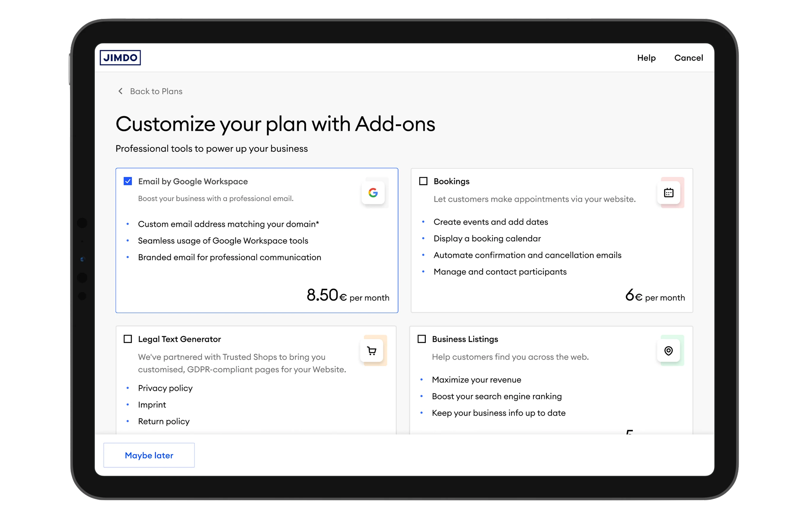
Then we moved add-ons into the flow and tested where they landed best. That also gave us a place to ask questions: once add-ons live at the moment of payment, you can show a feature that does not exist yet to people who are actively spending money, and find out whether anyone wants it before a sprint goes into building it. We ran those honestly. Clicking said "thanks for your interest, we'll let you know when it's ready" and put you on a list, so the click bought you something.
Red already had a job
A visual refresh of the pricing page was already planned, so engineering time was allocated. That is the cheapest moment in the year to change anything, and I took the opportunity to go beyond a simple restyle.
We knew the page had a lot to fix, and the red most of all. The prices, the discount badges and the countdown were all red, and Marketing had analysed it three years earlier: red had won. That is a real argument. It was also colliding with the design system, where red is what an error looks like, on a subscription people are meant to keep for years.
I asked for one week to test it again. A full week, and no measurable difference in either direction. Red went back to meaning one thing in the product, and the pricing page could keep being tested without carrying a three-year-old result into every decision.
With that settled, the rest of the redesign could go ahead: prices twice the size, plan descriptions rewritten around what each one is for, and plan cards ordered from highest to lowest, which came from an A/B test.


Green shipped, and the price includes VAT
Our engineering lead had seen how another website builder handled long-term plans and brought the idea to the team. We landed on a banner at the last step with the exact amount you save by switching to a yearly or two-year plan. Then we spent a surprising amount of time on its colour.
Green was our colour for confirmation and purple was the colour for upsells, so the design team and I argued for purple: once green sells something, it stops meaning "done" everywhere else. Our VP of Product preferred green. We agreed to test it. Green converted better, so green shipped. My case was about what the colour costs in the rest of the product, which a checkout metric cannot see.
The price was the other argument. One proposal was to show prices without VAT, because our customers were small businesses. Many of them were just starting and did not know yet how reclaiming VAT works, so the tax would appear at the last step of a flow we had spent months smoothing out. In a qualitative round, people said a version of the same thing: shown one price and charged another, it felt like a trick. A price is one promise made twice, and the two have to match. Checkout kept prices with VAT included.
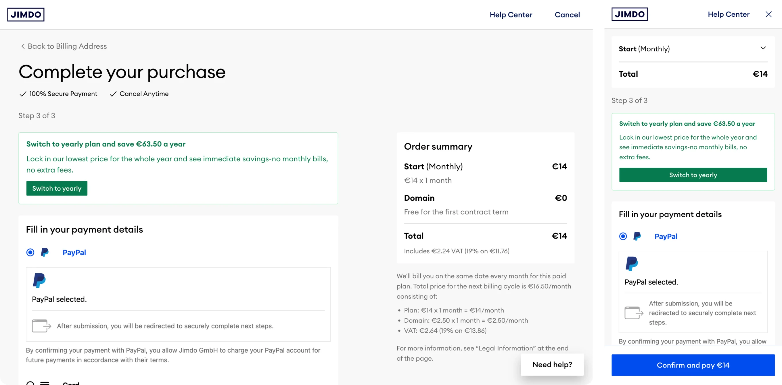
Trust, before the form
Checkout had no trust elements. They sit above the form, where the doubt starts.
An amount, not a promise
A number people can check against the order summary on the same screen.
Stripe's parts, our system
Stripe decides how payment inputs behave. Where it left room, the design system decided how they look.
No surprise at the end
The total already carries the tax, and the breakdown sits where people check the maths.
Designed for the phone too
The narrow screen was where the audit found the highest drop-off.
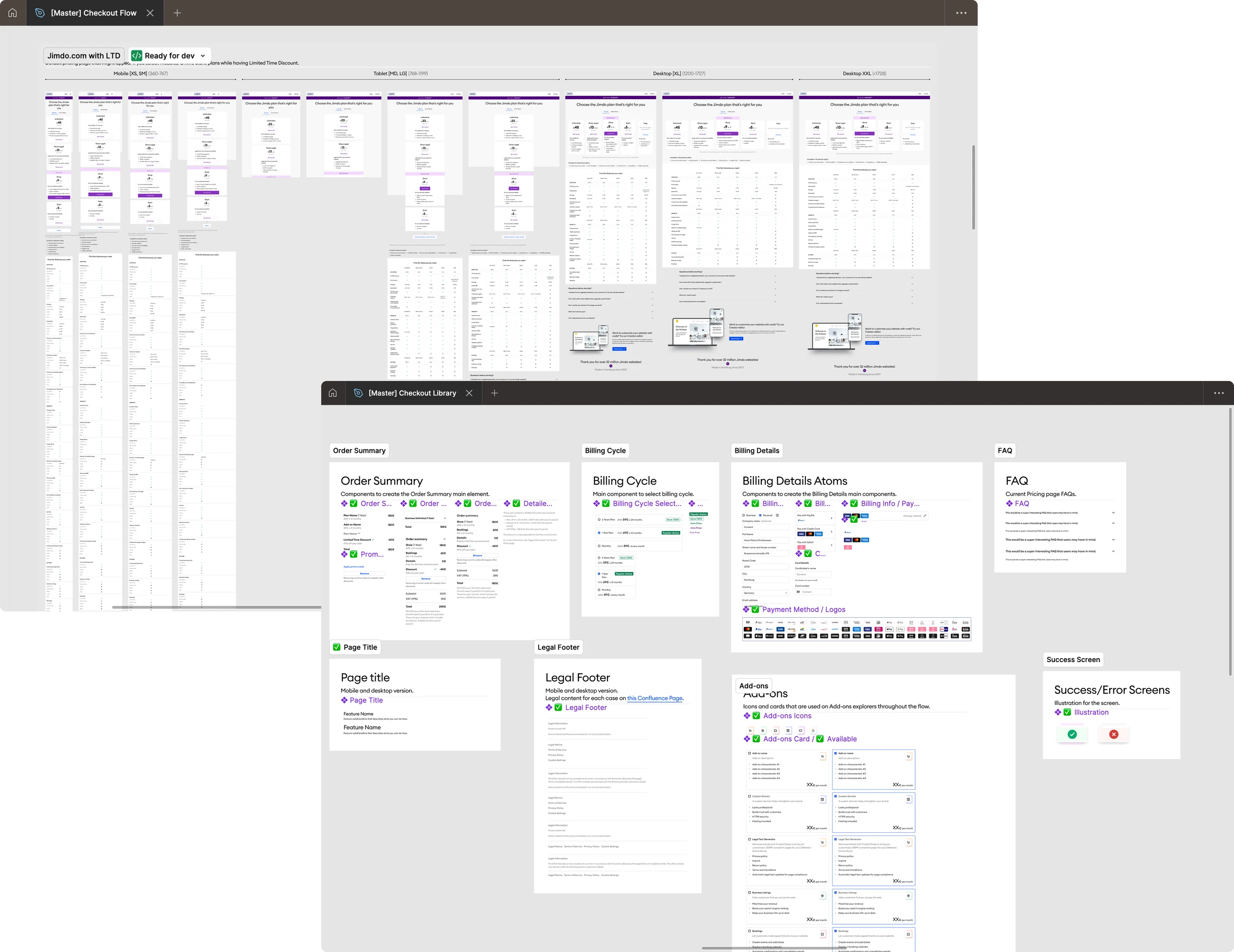
A library that made every test cheap
Order summaries, billing cycle selectors, payment logos, add-on cards, legal footers, success and error screens. Checkout was the only place in the product that used them, so none of it lived anywhere reusable.
So the first thing I did at Jimdo was build the checkout library: one master file where the specifications live, variants for every breakpoint and state, colour, spacing and type set up as Figma variables and tokens, naming agreed with engineering so a component means the same thing in Figma and in the code, and each set documented with where it is used. Once it existed, most test variants took an afternoon to build. It is the practice I had learned at BlackRock, brought into a team that did not have it yet.
What actually shipped, over eight months
- Rewrote and restructured 4+ in-product landing pages
- Restyled the pricing page
- Added Stripe and Apple Pay
- Introduced upsell banners, modals and pricing highlights
- Created prompts for yearly and two-year plans
- A/B tested add-on flows and placement
- Maintained the team library and design documentation in Figma
- Proposed a pricing and packaging structure, presented to the CEO and CPO with the checkout PM
Measuring is what made disagree and commit work
Everyone says they disagree and commit. It only holds if the disagreement has somewhere to go.
Without that, committing means the quieter person stopped talking, and the same argument comes back in three weeks with the same people and the same opinions, because nothing ever answered it. Here each one had its answer agreed in advance: a week of traffic for the red, an A/B test for the green, a round of research for the price. Committing costs you nothing when you know the question is going to get answered, and you can back something you argued against without it being a defeat, because the decision belongs to the evidence and not to a person.
That is where the real saving is: not in the conversion points, but in the time nobody had to spend arguing.

Hola, I'm Lu. Senior Product Designer, 6+ years across different industries. I start with the real problem, make complexity understandable, and stay close to the outcome. More about me →